Blessed Bites is a startup restaurant run by a lovely couple with much gratitude for life and immense pride for India in their hearts. They wanted to represent these notions in their restaurant identity and wanted something that could stick and stay long as a brand.
Our initial discussion with them led us to understand where they came up with their original name and identity 'Rollers and Toasters' which was very literal in describing the food they served and the fun take on roller coasters was, we thought, an unnecessary element that led to confusion amongst customers.
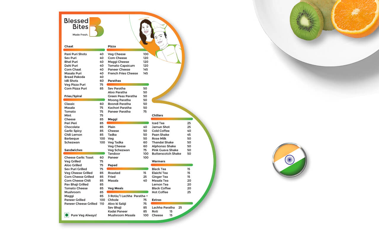
"Blessed Bites. Made Fresh."
We had a great time coming up with the name 'Blessed Bites' and the tagline 'Made Fresh' in this rebranding exercise. It fit seemlessly with the owners' ethos. We used the tricolour saffron and green colours in the logo that represented their love for the nation.
A clean menu card was designed using the branding to make it even more purposeful. The couple insisted on having their own identities also be incorporated in the design and so their sketches were created and added to the menu.
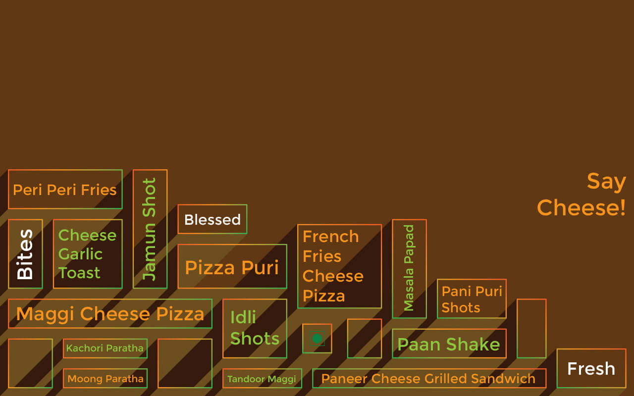
"Clean lines. Clear products."
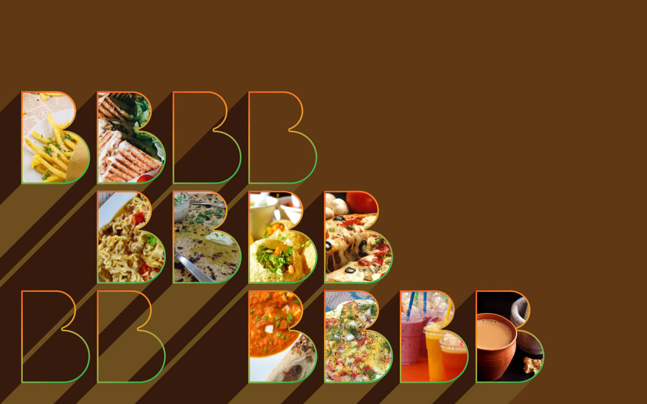
Environmental graphics were also created utilising branding to give the restaurant a clean and hygenic look and feel. The photographs used in the designs are of very high resolution giving crisp prints that display the products clearly.